Project information
- Category: Brand Identity
- Project date: Spring 2022
Subaru Rebrand
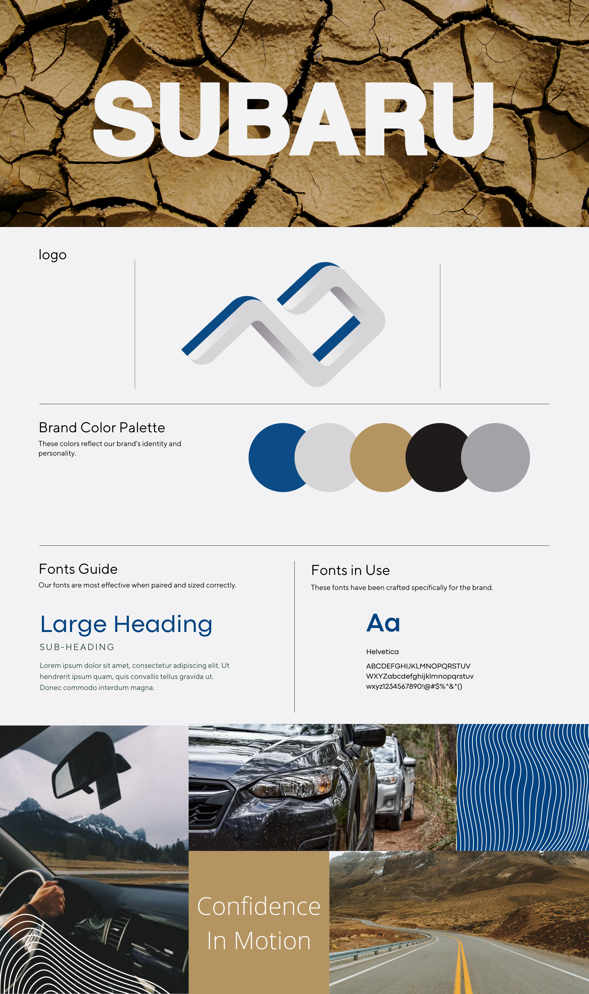
The word "Subaru" means united in Japanese, it is also the word for a six star constellation. The origin of the company lead back to six separate companies who united into one, named Subaru. The logo for the brand reflected the constellation, and continued to be the main focus for over 50 years.
The rebranded logo keeps the symbolism behind the origin of the company, just without the stars. The shape of the logo portrays the position of the Subaru constellation, the six points on the logo are where the six stars are in correlation to each other.
The logo also is in the shape of a mountain. When the Japanese brand migrated and begin selling in the United States, Americans adopted the company as their own and it became one of the best-selling car brands in our history. For the American culture, the company is best known for their AWD cars, and adventure style. This is why the shape of the logo is also a mountain, to symbolize the Subaru brand we know today.
The blue in the logo signifies reliability in their cars, and it connects the new logo with the old since the original Subaru logo has had blue in it for many many years


